Design is Everything, Steve Harvey’s Card
December 24, 2015 in Design | 1 min read | Tagged: talks design best practices ux
A few days ago, I had a presentation for my colleagues in the Insight Centre for Data Analytics about the importance of design, explaining that design is everything for anything around us, you can check the slides here if you’re interested.
If you thought about blaming Steve Harvey for his mistake in Miss Universe announcement, you should really rethink about it, because I blame the designer of the card!
Everybody saw what happened with Steve Harvey on Miss Universe 2015 announcement, if you didn’t:
30 minutes later, the video went viral on the Internet, and everybody was reacting to that, criticising Steve Harvey to be with clumsy personality for his known comedian background, and that he’s an actor because he can’t read … etc.
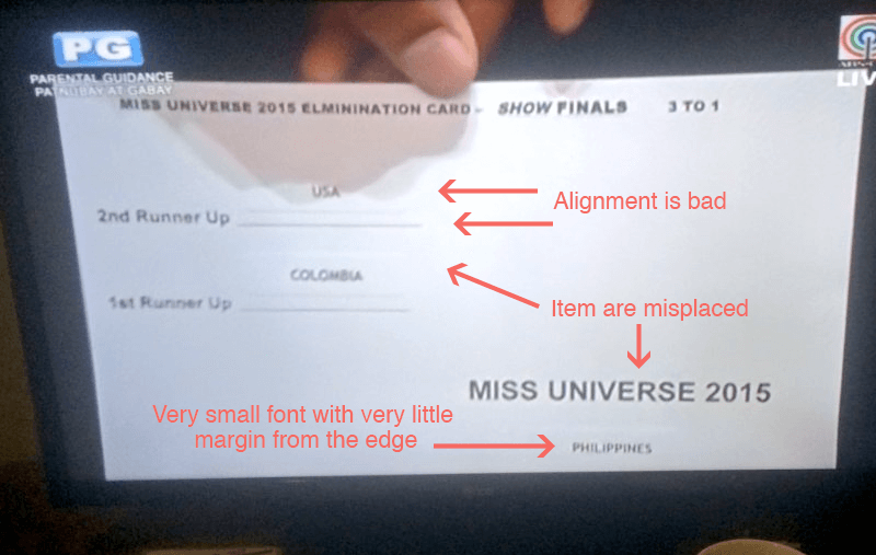
When I saw the card, I knew it was the problem of design although I don’t know anything about Steve’s ability to read.

As you see, I could clearly see what problems in the card, and I saw an example from the internet about one scenario that might happened on stage that day:

I do actually blame the designer (editor) who printed this card, as it’s way misleading especially if you’re presenting to millions on a stage, within non-regular settings of light.
This is one suggestion from me on how the card design should be:

Thanks.